Words are the most powerful way to communicate and if you someone like me who keep taking notes, everywhere and anytime. You must have used a certain mix of visual element in your writing. I like to do so, even today. I prefer to use pencil and paper to jot down meeting notes. A full page meeting notes will have not only words but also connections (ideas and things to-do).
The one thing that keeps me hooked to use blank page and pencil is the canvas it offers. A free form of writing canvas where my ideas are not limited to lines and blocks, but I can use all the available space as per my needs to create a more engaging and memorable representation of my notes and ideas.
In the digital space of notes and writing apps, I recently discovered Scrintal. One tool which is closest to my open canvas, free-form of writing and thinking philosophy.
What is Scrintal?
Scrintal is an easy-to-use digital canvas to convert your creative ideas into structured knowledge.
Turn your Complex and Scattered idea to Clear, Creative & Visual ones.
Why Scrintal and what makes it special to my use case?
I have spent more than 3 years in this space and explored more than 45 apps of personal productivity area. One of my best experience of capturing my idea flow is with Mem. I have loved the simple canvas where I don’t have to think about my organization of notes.
The experience was so fluid and friction-less that I look forward to the same in any app I try, today as well. Scrintal — offers the same with a flavor of visual elements.
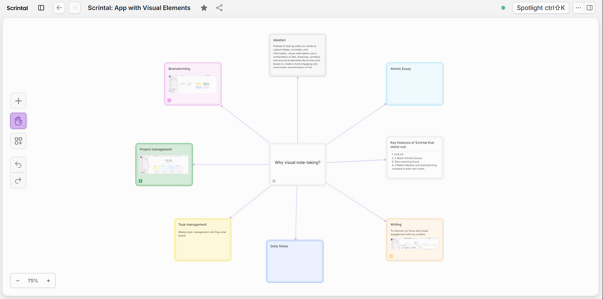
It has an infinites white board experience which has endless potential and customization possibility. I love the freedom it offers to my thoughts and ideas. Every idea may not connect with each other and may not expand further too, and with Scrintal you can capture those in a visual cards.
As usual, here’s my reasons that makes Scrintal a special addition in my workflow:
App Experience:
Simplicity meets modern design and intuitive user experience. Scrintal outshine many of tools available in the productivity app market with a clean, simple, intuitive and modern design. With Scrintal you will feel centered yet connected, they have utilized the available space very thoughtfully. I like how clean the side bar menu looks with different color and icon.
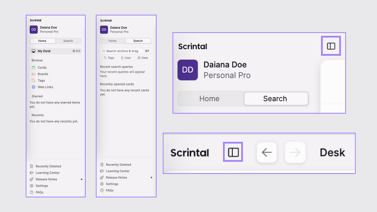
Everything in Scrintal supports drag and drop. You can simple drag your card from side bar and drop it in the current card or board.
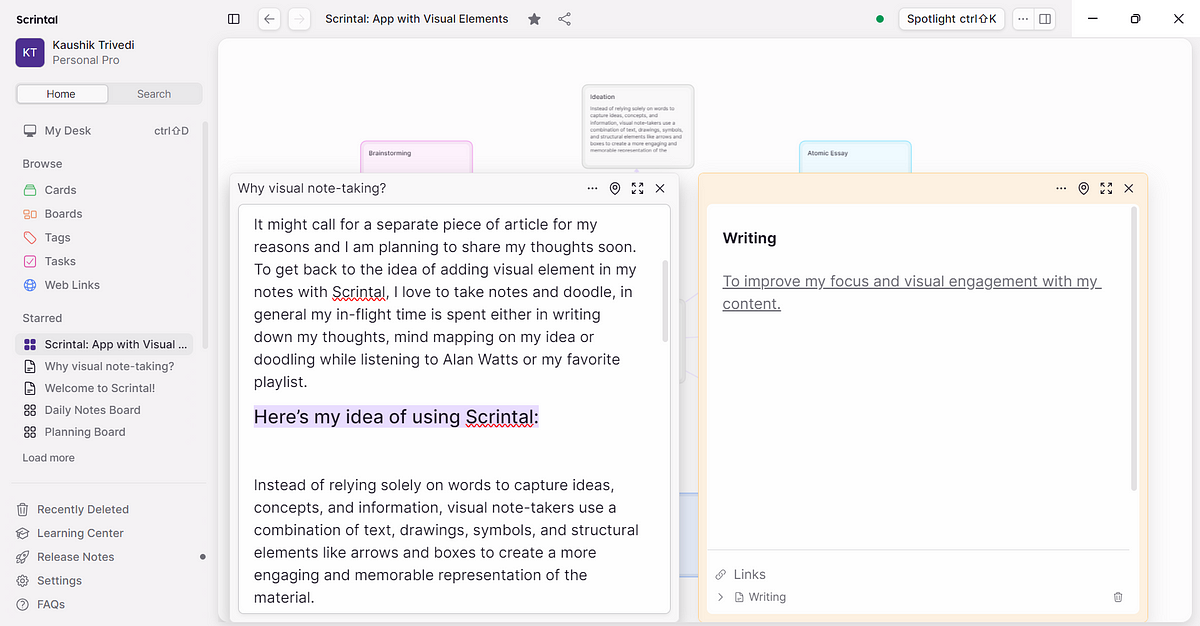
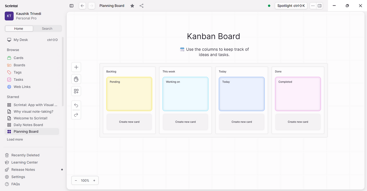
In Scrintal; Side bar menu is the area of navigation. You can browse thru your cards, boards, tasks, tags and links. Also if offers your starred and recent options there. Also, search is faster and super relevant from the sidebar menu. My favorite part of the side menu is the unified task view, where you can have a bird’s eye view of all your tasks from all your boards. Not only that you can hover over and quickly glance the details of the task.
Scrintal also offers Spotlight search bar on top and having right side bar menu with all your link access.
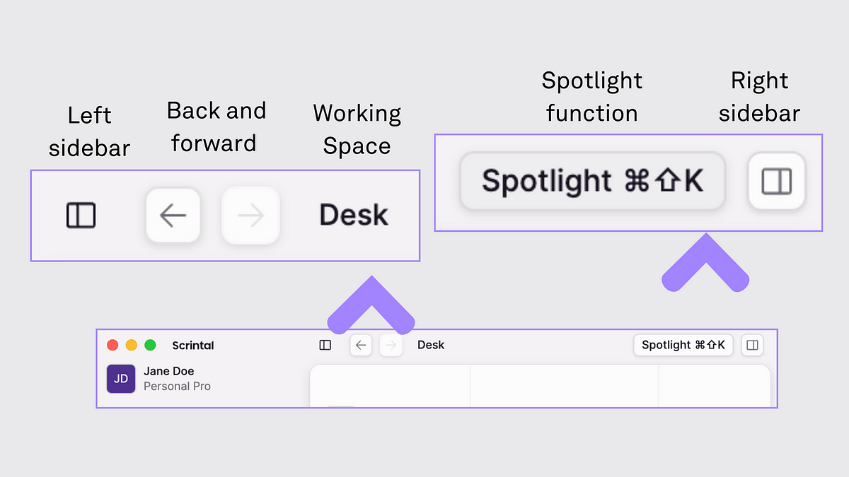
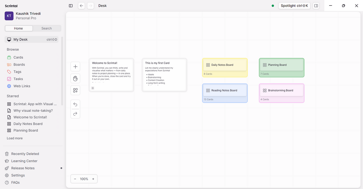
Overall, the experience and navigation feels amazing in Scrintal. Once you start using the app, you can immediate feel confident about the experience.
Cards:
The foundation piece of Scrintal is a Card. The best part is a card can be a post-it note with a single idea or it can serve as a complete doc for a blog post or research paper. I would say this is the most powerful feature of Scrintal. It takes some time to get along with the idea of working in this system where multiple cards can be opened, but within just a few minutes you can master the basics.
Scrintal has a powerful design and experience, that supports in every action. Creating new card, board or simple text is just a breeze. I have been enjoying working with this idea and started outline every project with different cards, different color combinations.
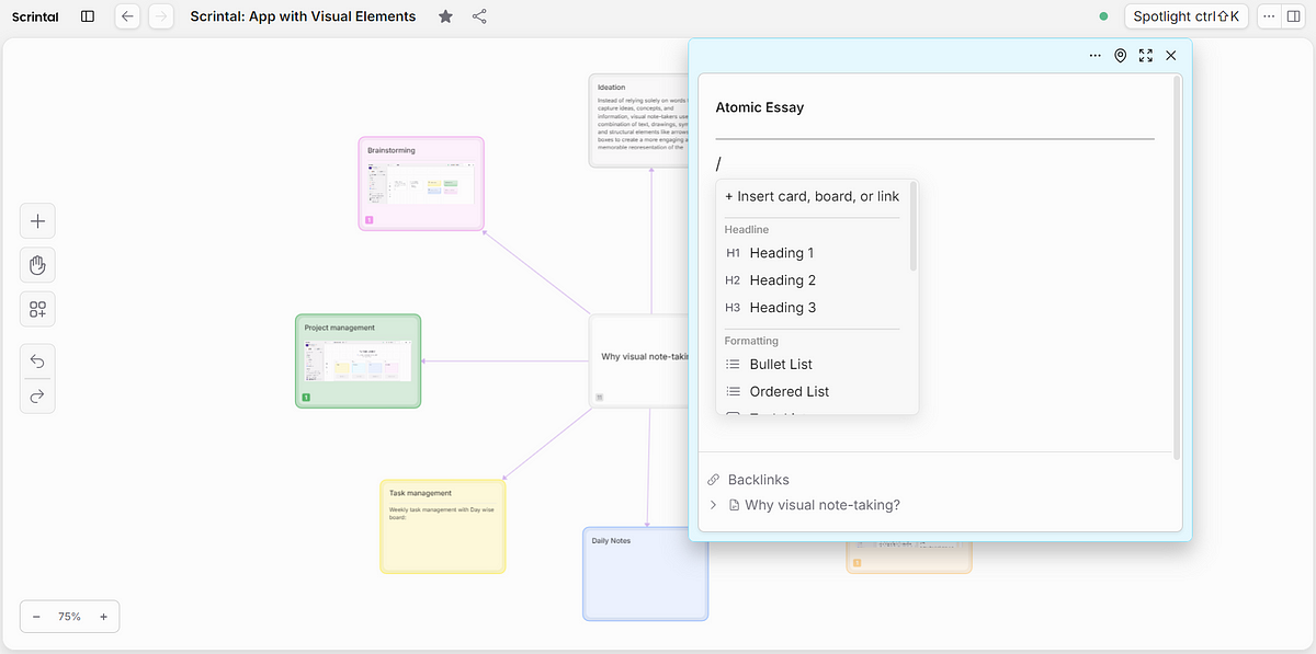
Cards has super power in terms of customization and options. You can simply change the color, toggle layout, star, share, tag and export and many more. Card inside Scrintal also supports PDF and other media files and universal slash command for your notes too.
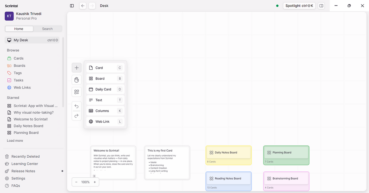
Knowledge graph & Linking:
If you are a person like me, who feels sometime limited with your notes structure. Scrintal is here with unlimited flexibility and customization options of your content. Knowledge graph is something like mind map with a much wider view and flexibility. You can change the layout completely to have a better understanding of the subject.
With powerful linking of your cards and notes, you can clearly make the most out of the content with Scrintal. Linking your notes is as simple as drawing or connecting an arrow. No other tools offer this simplicity of inter-connected ideas.
I would say, Scrintal has made linking or inter-connecting thoughts way easy for us. It is not just easy to create the link but you can actually use it. Accessibility and use-ability of your connected cards and notes are endless. Your right bar is a dedicated area with all your links and you can also open links and work parallelly, something I truly appreciate.
Visual Organization:
The core idea behind Scrintal is to empower user with a better clarity of thoughts and make it easy to capture it. Visual elements makes it way easy to focus and engaged with the content. Visual organization of your cards, boards and ideas makes it easy to focus or view all the possible details just by zooming in or out.
It is a free form of your notes that makes your creative ideas to foster and also makes it easy to jot down all the possible point during idea building process.
I am not big time user of any collaboration feature in any app, but with Scrintal sharing, collaborating or publishing is just super easy. You can share and collaborate with your team by just sharing the board to work together or simple publish your board to the world in reading mode.
Scrintal is available as Web app, MacOS & Windows app.
What I want to see in future with Scrintal is how it combines the calendar. It would be amazing to see the daily notes section with calendar. This will add super power to tasks and projects for sure.
To conclude:
Scrintal is a must have tool for my creative, brainstorming, idea-building process and has potential to replace my standard note-taking needs too for example; daily notes, weekly plan, task and project management. The use of with Scrintal are endless as of now, I am looking forward to use it as my daily driver for project management, as my atomic essay collection, my daily planning tool, as my research and writing platform.
I will be writing a series of blogs on my use case with Scrintal and recommend you to try it to make it your personalize creative partner.
Here is a 10% discount code to support you: APPADVOCATE10
To support me, my affiliate will earn some commission from your purchase but at not extra cost to you. So explore, Scrintal and enjoy the free form of thinking and capturing your ideas.
Also, Scrintal Ai is on the horizon and will be launched very soon. Stay tuned for the updates.
Thank you for reading,
Keep reading, Keep sharing.
Astu.
Support my work by using any of the following affiliate app at no extra cost to you;

