I have been thinking about writing this article for a long time, I could not understand the reason. But once I started putting up my thoughts together I understood it. While working on this article, I am getting a clear and better understanding of my own requirement from the Task Manager and hopefully, I choose one, wisely.
Before we enter into the comparison, let us first set the rules of the game:
- This comparison will be based on my personal use, requirements, and experience.
- We will only cover the core feature sets of task management not going deep into all the specific features of both Apps.
- This comparison will focus on Mobile devices and their usability only.
With the stage set, let’s define the 4 core feature set required for Task Manager:
- UI and The Task Input
- Task Management
- Project Management
- Prices and Platforms
UI and The Task Input:
Todoist
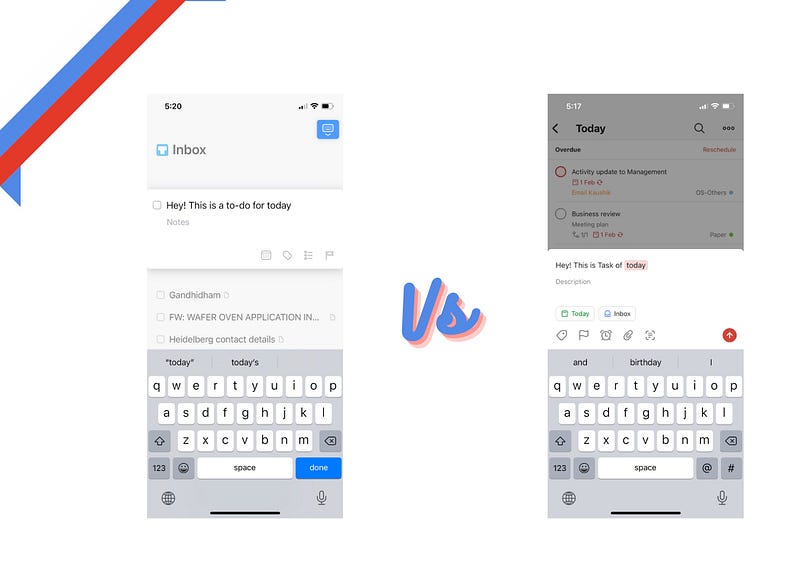
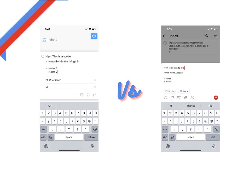
All the users will appreciate Todoist for it’s natural language processing and support for syntax like @, # and !! etc. Todoist literally outperform all its competition in this area. Scheduling is an ease inside the tasks which supports priority, label, date, notes, attachment (file, picture) or reminder etc.
More of an experience of meticulous entry of the task by capturing all the essential data.
Once you start playing with Todoist, you appreciate the solid build, thoughtful and thorough design which supports all the required feature sets to be not only your task manager but a contender of project management as well.
Todoist also supports variety of theme options. Pro plan only.
Things 3
Keep it Simple while making it intuitive and fluid is the philosophy behind Things 3 and it works, very well. Task entry is super simple and clean experience with supports of notes inside the task (supports markdown), checklist (kind of sub-task), tags and deadline.
Things 3 approach is very minimalistic and intuitive while checking all the right boxes.
While Things 3 approach lies in its simplicity. It is really difficult to design such a simple task manager which makes all the interactions delightful. How Things 3 looks, works and feels is the key differentiator amongst the universe of Task Manager Apps. A pure joy.
The Task Input:
UI:
Todoist
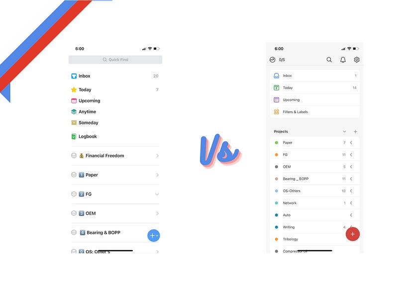
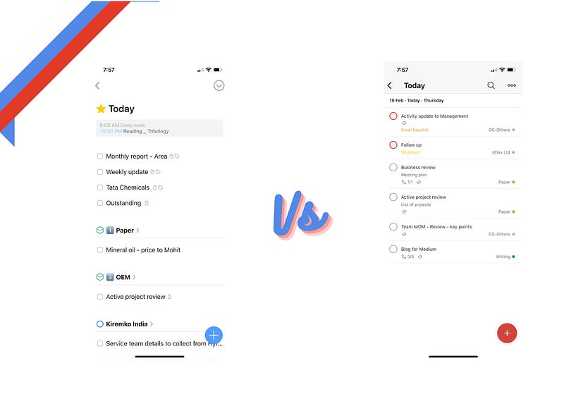
Todoist offers a well-known, solid build experience when it comes to the home page and Inbox, Today, Upcoming and Projects.
Todoist does have options of filters and labels which comes handy at times.
You can view all your related tasks directly from the Home with the help of filters and labels — an excellent idea.
Things 3
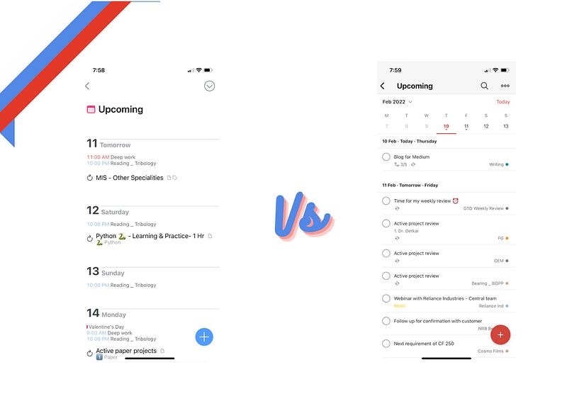
Things 3 does have different approach towards home page with its additional sections like Someday, Anyday and above all Logbook (a specific section to log our daily achievements, I loved it), apart from Inbox, Today, Upcoming Views.
Things 3 have Areas — built inside the App. Areas for different set of goals like Personal, Finance, Writing etc. and you can have project specific to Area or separate and this makes life easy and sorted.
Task Management
Todoist
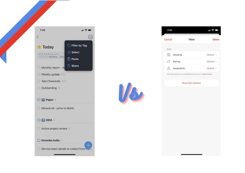
We can view or set task views as per our need inside Todoist like By priorities, assignee, label or projects — super useful to look at your day at a Glance.
Offers both the views List & Board! as well.
Selecting multiple tasks, scheduling them and assigning to project is also a click away for Todoist and you can also further break down the task with sub-task.
Todoist is the benchmarked App when it comes to task management. No doubt about it. Period.
Things 3
Things 3 — do have an option of looking at your Today’s task by tags or group the task by List (Area) — this will give you an overview of your Today’s Task.
One of key difference with Things 3 is inbuilt Calendar in Today’s View and Upcoming. You can look at your calendar events right in front of you. A good design for sure.
With Things 3 super snappy, fluid and dynamic animated design, selection of multiple tasks, moving it to Area/Projects works and feels just amazing.
Things 3 do have a separate section for evening. Yes, we have things to do at home too.
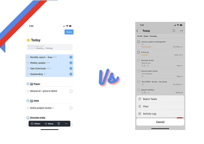
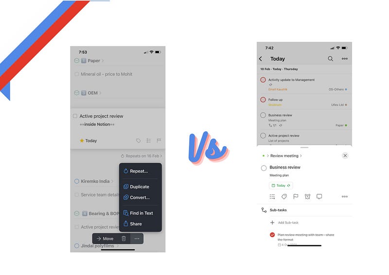
Both the Apps makes it easy to convert your task into recurring task however inside Things 3, you can convert any task into Project.
Project Management
Todoist
Yes, I know both are Task Manager but we tend to expect more from everything and some time a design is so flexible and solid that it has no boundary and use case are limitless.
Todoist have everything a standard project management tool offers and I have seen so many cases. Creating project inside Todoist is super simple with options of new or project inside any parent project, list or board view and (collaboration) — not available in Things 3, if you are looking for Task Manager to work with your team and collaborate. Stop looking, Head to Todoist.
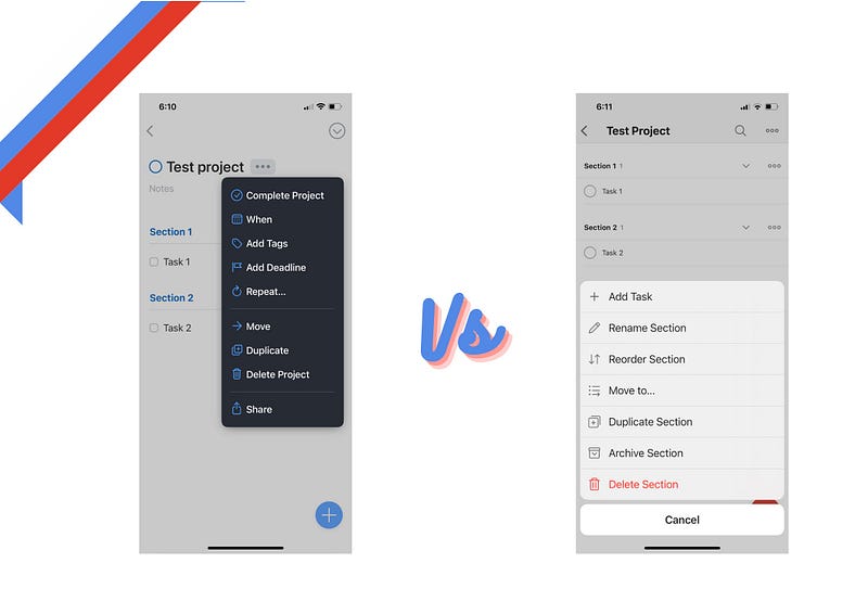
You can add sections, sub-tasks, re-order, move to other project, duplicate or archive the project. with its colour pop up’s — project looks beautiful and elegant inside Todoist. I tried to use same colour for similar projects for ease of identification.
With its support for sub-tasks, files, attachments, sharing, priorities and reminders Todoist to make an excellent project management tool.
One more important feature when it comes to project management with Todoist is its ability to add tasks via email specific to projects. A feature must to have in any Task Manager, really appreciate the thought behind it.
Things 3
Things 3 have Areas — super useful and neat idea.
You can have specific areas where all your related projects lives inside and it is so well implemented, once you start using it and you won’t go back to any other Task Manager for sure.
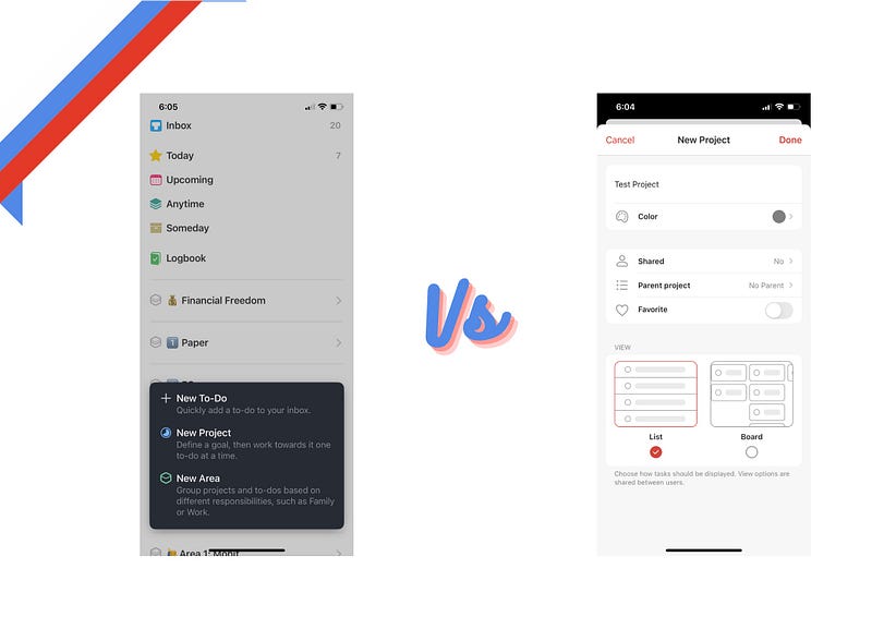
Things 3 makes it so simple and intuitive starting from creating project, making sections and headings, add deadline, repeat, tags, duplicate etc just a few clicks and you good to go. Also small yet delightful design clues like progress circle surrounding your project to give you hint on your progress.
You can also use Mail to Things and create task directly by sending your email to Things 3. Your email will land in Inbox and you can further move it to concern project or area.
Magic Plus + can be dragged and inserted anywhere for example project, inbox, today, or section. Super smooth animations makes it beautiful and enjoyable experience.
With the support of deep linking with Craft.do, you can very well use Things 3 as Complete Project Management tool. Yes only for personal use not possible to collaborate.
The Project Setup
Prices and Platforms
Todoist
Todoist is available for Free for starters and for individual Pro plan starts at 3 US$ per month (if paid annually)
Todoist is available on all the major platforms like Android, Web, Windows, iOS etc.
Things 3
Things 3 is exclusive to Apple Ecosystem and have apps for iPhone, iPad and Mac with one time purchase, no subscription.
iPhone: 9.99 US$, iPad: 19.99 US$, Mac: 49.99 US$ (15 days Free Trial) and No free version.
To conclude, which I have been trying at least for last 2 years.
If you are looking for using your task manager on multiple platforms and with your team. Go for Todoist.
https://get.todoist.io/yi0ou0ipn97c
If you are already inside the apple ecosystem or planning to, Go for Things 3.
This can not be so simple but for me, This is how it is as of now and I am using Things 3.
Thanks for reading.
Keep reading, keep sharing.
Astu.
