It will make you fall in love again with your writing!
My note-taking requirements has changed over last couple of years, still I prefer a physical pen & paper, given a choice to write or think on something but most of the time I am good to go with my iPhone and iPad.
A solid note-taking app is on top of my requirement for my mobile devices.
Nowadays there are so many options available like Notion, Coda, Workflowy etc. which offers a blank canvas for all your needs.
A multi option tool — ready to work as per your need. May it be a task manager, project management, note-taking or simple wiki.
I am always fascinated by the idea of having all in one option to manage our daily chores, projects, notes and tasks etc. your only and one tool, one app and after trying out the same with Notion and Coda. I have to change my views.
Yes. that’s a good system to have but not for me, not yet.
I like to have specific app or tool for the specific requirement like a dedicated note-taking system, a task manager, a project management etc.
Here is my most loved app for the note-taking:
Craft.do
Let me confess first, I am one of the many guys who do not like the block structure still Craft has become my preferred app for note-taking. I’ m surprised too.
The reasons are very simple:
Craft doesn’t only meet my requirements but it’s surpasses my every expectation by miles, each time!
Before jump in, What makes a note-taking app worth?
Lets look at my top 5 reasons to chose an app for note-taking:
- Mobile friendly UI
2. Speed
3. Export — options with basic aesthetics
4. Tables
5. Available on web
Welcome to Craft
Simple, Fast and Native:
Yes, Craft is build natively for your mobile devices and it is a big big plus. I am a non-technical guy still understand and appreciate the difference between natively build app or app which is squeezed out from desktop or web to your mobile.
Craft offers very intuitive and fluid writing experience on any device, be it your iPhone or iPad.
Let’s look at the basics:
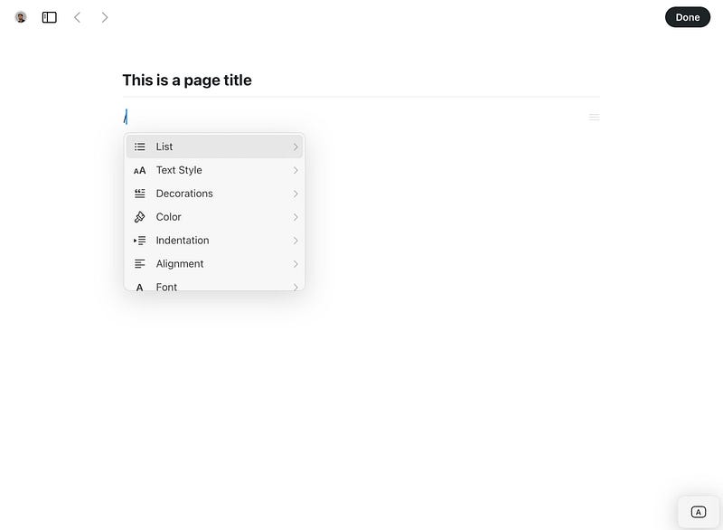
Slash has become an universal command in note-taking and knowledge management app world. It opens up a window of possibilities and with Craft you can choose – Type of list, text style, block or focus, aesthetically appealing options, alignments, fonts, etc.
Example:
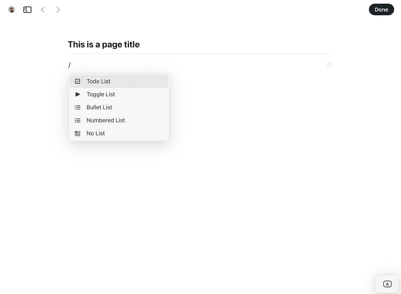
You can create page inside page – which has been standard in block type note and knowledge management apps, Craft offers added option of Cards.
An Example:
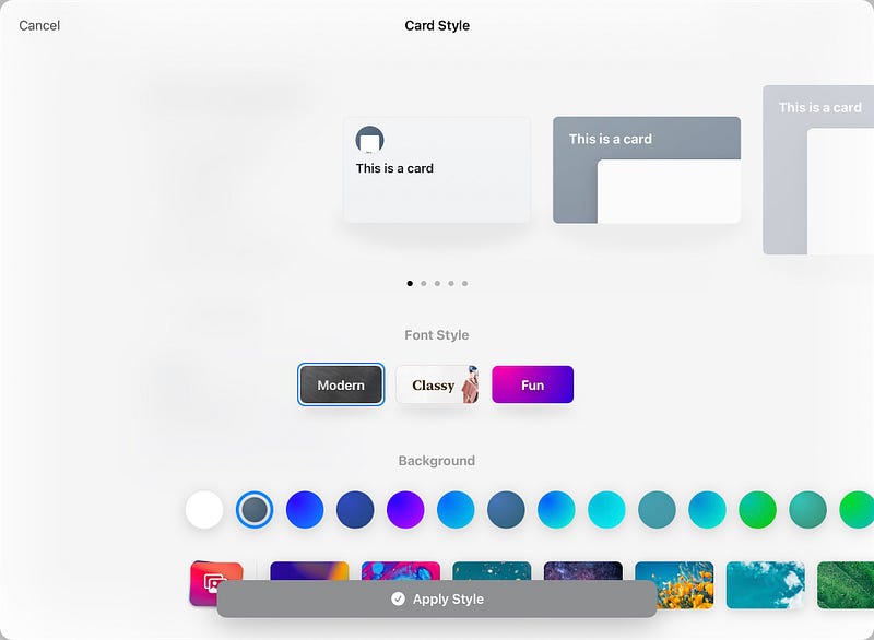
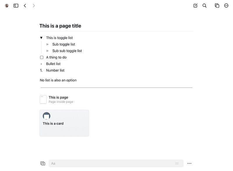
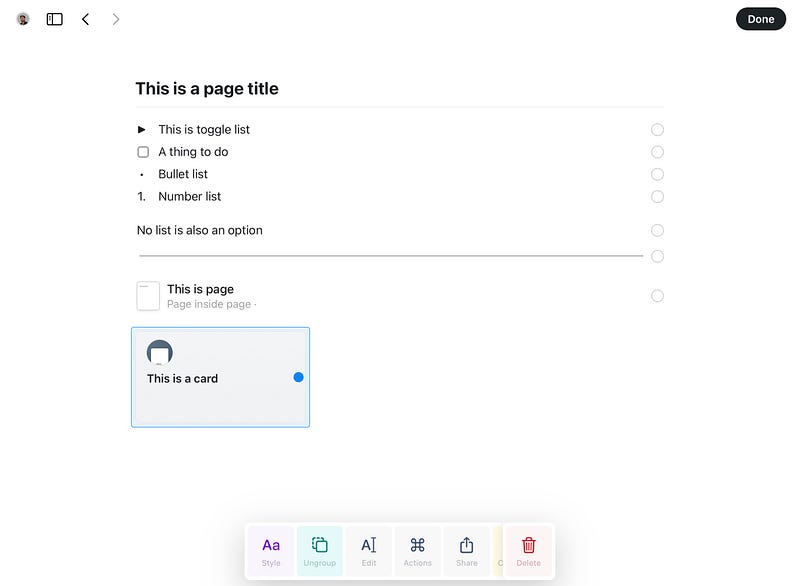
Options presented while working on notes can be found simple by choosing the block, you wants to play around with:
You can – play around with styles like make it title, block, page or card, to-do list, numbered list and change the color of the fonts etc.
You can group the selected block and make them card or page, your can edit and share.
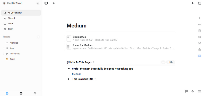
Linking pages inside Craft is also very easy — simply by @ you can link and nest the pages inside pages and all the linked page information will be right below, you can expand or collapse, view or hide the details:
Craft is one of the best designed app to work with images and files.
Here’s an example:
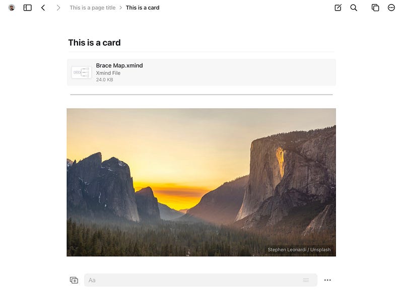
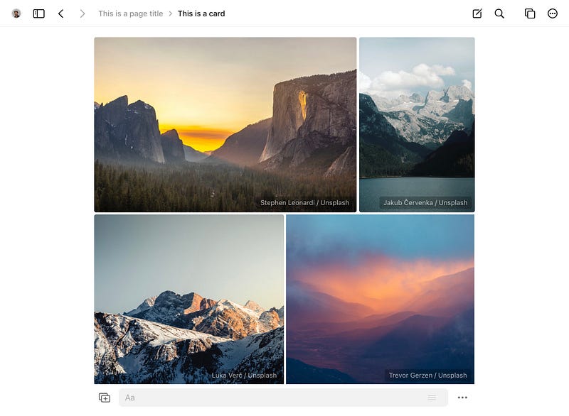
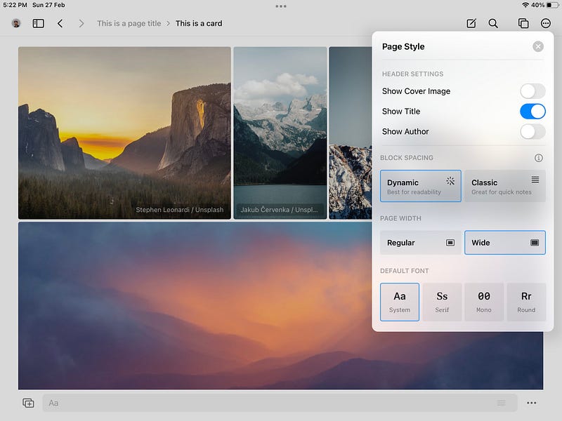
You can play with page options and create a beautiful looking document. Which can be exported or shared in following options:
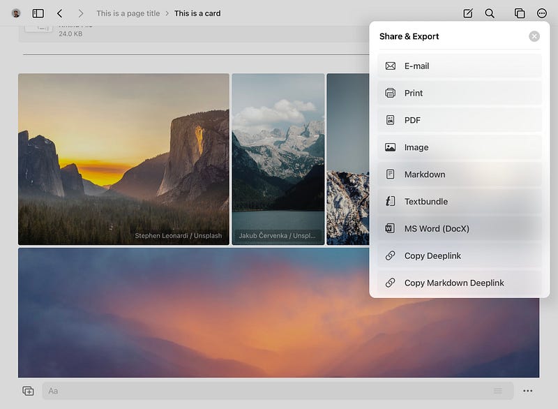
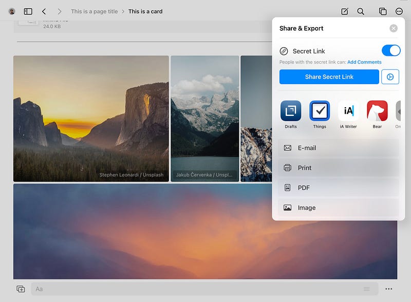
Craft not only offers multiple options to share and export but also offers direct sharing with Drafts, Bear, iA Writer and above all my favorite Things 3 – you can directly share a secret link and create ‘Task inside Things’
A super useful, handy feature and integration.
I’m really impressed with the following notes from the Getting Started & Welcome to Craft, it has really helped me in understanding the core theme of the design and how best you can use it for your personal use and need:
- Overall don’t overthink it. Start writing in Craft as you would normally– and whenever you feel you need a bit more structure or your document is getting too long – you’ll naturally explore how pages work.
- The best thing is that you can simply start with a rough draft and “craft” it into something that looks and feels great when shared – Craft grows and adapts to your ideas – no matter how simple or complex they may be!
Let’s take look at the UI and Note-taking structure inside Craft:
UI
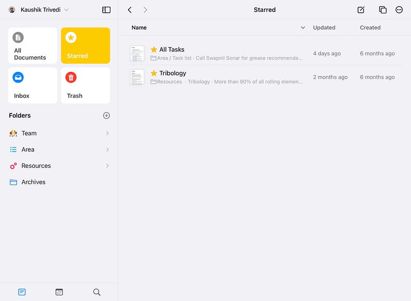
Clean UI with side panels which offers standard options of All documents, Starred, Inbox and Trash views.
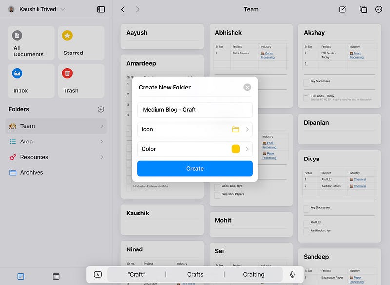
You can create Folders – beautiful icons, color to choose with.
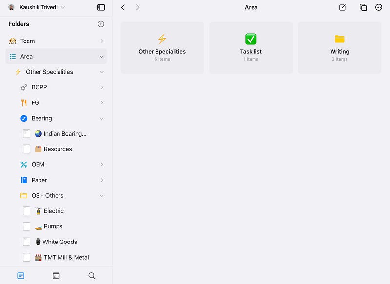
Personally, I like the idea of having Area’s — specific to your work or business, passion and interest etc.
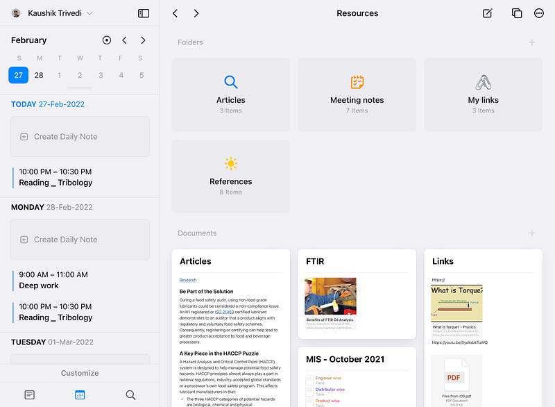
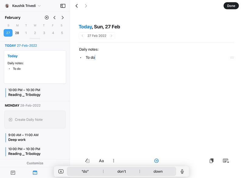
One more benefit with Craft is – daily notes:
which is quiet a neat feature to capture your daily journal, thoughts, tasks or ideas.
Bonus with going all the way with Craft for me personally, is they deliver their promises, On time. I have been using Craft Web App on my Windows laptop for some time now and facing no issue of sync or speed.
Enjoying my journey with Craft and looking forward for long-term committed relationship.
You can explore with free plan but I like and recommend you to go for Professional plan – Craft. It offers the best experience at cost of 4 us$ per month if paid annually.
Craft – has already started rolling out ‘Extensions’ which is in developer platform and opens up all the possibilities of extending your Craft notes.
If you happen to have at least one of the apple device, go and explore Craft. It will surely positively change the way you take notes.
Thanks for reading.
Keep reading, keep sharing.
Astu.

