Your go-to notes app from the iOS productivity world, Bear 2.0.
How do you improve a good notes app while keeping the best of it?
The answer is Bear 2.0
I have always loved and admired a simple, minimalist notes app and Bear is of the most beautifully designed app for iOS users.
Bear has been on my iPhone for a long time and when they announced an updated version with code name: Panda, i joined the early version to experience the upgrade.
Now, Bear 2.0 is almost done and let us see what all the improvements are.
The updated editor
Writing inside Bear has been always a smooth, friction less markdown experience and with the updated editor with Bear 2.0, this thing has improved. In terms more clean, no visible markdown syntax inside your notes gave a more pleasing writing and reading experience.
You can also include tags, links with Headings and you can highlight it too.
Familiar yet more functional UI and UX
Have been exploring note taking tools for a couple of years now, and to be honest Bear has been the most minimal, simple and intuitive note taking experience you can find on mobile device. And how Bear does this, is with its UI and UX; with Bear 2.0 the experience has changed positively.
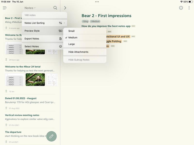
Bear 2.0 offers more functionality with better UI, UX. The updated markdown experience, clean writing, minimal distraction, easy to tag and link the content, specific note list provides more flexible and dedicated menu of your current notes with option of export, sorting etc.
Links # tags and Toggle Folding
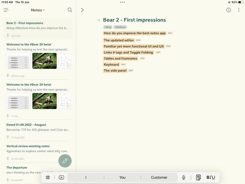
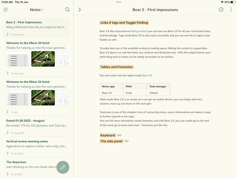
Bear 2.0 also improved on [[linking content]] you can now use Bear 2.0 for all your connected notes and knowledge. Tags inside Bear 2.0 is also easily accessible and you can use link or tags in your header as well.
To make best use of the available writing or reading space, folding the content is a good idea. Bear 2.0 does it so well that feels very intuitive and distraction less. With this simple feature your entire blog post or notes can be simply accessible as an outlines.
Tables and Footnotes
Now let’s enter into the tables inside [[Bear 2.0 ]]
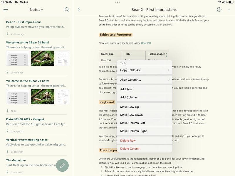
Table inside Bear 2.0 is as simple as it can get on mobile device, you can simply add rows, columns, move up and down or left and right.
Footnotes is one of the simplest form of connecting notes, source information and makes it easy to further expand on the topic.
You can link more information inside footnotes and with Bear 2.0, you can simple go to the end of the word, go to menu and insert [^1]footnotes just like this.
All new customized Keyboard
The most visible update is the keyboard, it looks and feels like it has been developed inline with the design philosophy of minimalist, simple and intuitive notes app.
I have been playing around with Bear 2.0 on my iPhone and iPad both and the note-taking experience is simply great. A big part of our interaction inside an app happens thru a well-designed keyboard and Bear 2.0 is all about that customised format keyboard user experience.
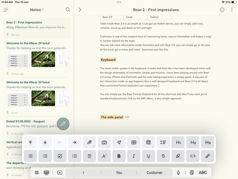
You can simply use the Bear Format Keyboard for all the shortcuts and also if you want go to standard keyboard just click on the ABC Menu, a very simple approach.
The side panel or side bar
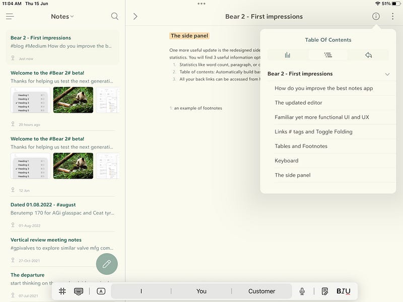
One more useful update is the redesigned sidebar or side panel for your key information and statistics. You will find 3 useful information options in the panel;
- Statistics like word count, paragraph, or characters and reading time.
- 2. Table of contents: Automatically build based on your Heading inside the notes.
- 3. All your backlinks can be accessed from here.
This is not all:
- Improved Search
- New themes, New widget for iOS
- Improved sketching on iPhone & iPad
Bear 2.0 is awaiting in Beta for your love and support.
Give it a try.
Thank you for reading.
Keep reading, keep sharing.
Astu.
[^1]: an example of footnotes

